

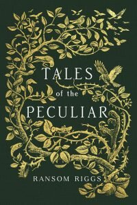
 What goes into a cover? Love, affection, sometimes stock photos – but that wasn’t the case with the cover of Ransom Riggs’ new Tales of the Peculiar.
In this collection of short stories, readers meet wealthy cannibals who dine on the discarded limbs of peculiar and a fork-tongued princess – only a few of the stories known to hide information about the peculiar world.
Instead of the photos that appear on the other books in the Miss Peregrine world, the Tales of the Peculiar cover is a little more elegant, hand-designed and created. Designer Lindsey Andrews took the reins on designing that cover for Penguin, and it turned out beautifully.
But how, exactly, did it get done?
Andrews designed the Tales of the Peculiar cover with the help of her boss, Executive Art Director Deborah Kaplan, and illustrator Andrew Davidson, who many will know for his work on engraving the UK editions of J.K. Rowling’s Harry Potter series. Andrews was kind enough to talk to us about the process behind the cover – along with her favorite covers she’s worked on and what it takes to be a cover designer.
Tales of the Peculiar releases tomorrow, September 3.
You designed the cover for Tales of the Peculiar! It’s beautiful, elegant, and simple – especially compared to the other Miss Peregrine covers. How did you work the aspects of the Peregrine world into the Tales of the Peculiar cover?
We immediately knew this book was something different, but it’s still part of the Miss Peregrine world—the book of peculiar fairy tales mentioned in the series. While this is not the edition the characters take from Miss Peregrine’s home, it’s one that has been specially compiled by Millard Nullings (the invisible boy). The tales included are just as peculiar and twisted as the Miss Peregrine series but also contain a classic moral center.
Pretty early on in the process we (Design, Editorial, and Ransom Riggs) knew that we wanted to work with the renowned woodcut artist, Andrew Davidson. He’s a master of his craft and has worked on just about everything (particularly notable, the adult UK editions of Harry Potter).
Both my creative director, Deborah Kaplan, and I art directed and oversaw the design process of this book, inside and out. These new tales are really the origin stories of the Peregrine world as we know it, so it was easy to pull lots of imagery from them. There’s certainly plenty of birds throughout. Also, I challenge you to find some of the secret objects and animals hidden in the negative space. There’s a polar bear, a face, a heart, and an eye.
What was the process like for you? How many versions did it take to nail? How long did it take?
For the cover, I went in knowing that we wanted a beautiful, detailed framework of some kind around traditional type. I had a hand in the overall design, but the imagery itself was created by the mastermind, Andrew Davidson. Andrew tried a few different layouts and it only took about 3 rounds to figure out the overall shape and design of the cover. We had all of the details locked down within a month and then it was time to play with color and foil options! We decided on a clothbound book with a foil stamp instead of a jacket to harken back to the older fairytale books of yore, like the Brothers’ Grimm.
This book is SO much more than just the cover. I can’t wait for readers to see the inside as well. We carefully considered every detail from the metallic gold marbled endpapers, to the ornately decorated drop caps, down to the ribbon bookmark.
The interior actually took a lot more time and work. We had to get 10 full page prints done to accompany each story in about 3 months’ time along with a few extra spot illustrations. Keep in mind these had to be scrupulously hand carved into blocks of wood and then printed on a traditional press. Luckily, Andrew was so inspired by the tales themselves, that he really connected to the stories and every illustration he delivered was just perfection. Every day that I would come into the office and see a new sketch or finished woodcut print was like Christmas morning!
Needless to say, it was a team effort with everyone working tirelessly right up until the deadline. And I believe we produced a beautiful piece of art!
Based on the other covers you’ve designed – including Anna and the French Kiss and The First Time She Drowned – you seem to favor symbolic imagery over other trends like handlettering. What are some of your favorite things to put in a cover?
Every book has such a different story to tell, that every single one has led me down a different path. A lot of my books do tend to focus on type and a central, more symbolic image. I don’t believe in telling the whole story on the cover. I believe it should give you a taste for what you’re about to read and also just be something really beautiful and interesting enough to make you want to pick it up. And honestly, I’m a big YA reader and fan myself, so I try my best to create something that would make me want to stop in a store, pick it up and say ‘ooooh’. It’s all about the ‘ooooh’ factor.
What are some of your favorite covers you’ve worked on besides, of course, Tales of the Peculiar?
I’ve been blessed to get to work on so many great books since coming to work at Penguin. It’s hard to choose, but some of my favorites have been Richelle Mead’s Soundless and her Glittering Court series. For both of these, I got to collaborate with two super talented photographers and we produced some stunningly gorgeous images.
I also had a blast conceptualizing and designing the cover for Hold Me Closer by David Levithan. I basically just really wanted to make something covered in glitter and I actually got to do it!
What do you want people to know about cover design?
Book cover design is essentially a dream job. I get to be surrounded by books all day and actually be a part of making them. It’s fun and creative, but it’s also still a business. We work as a team and lots of people have input into the final cover that you see. Every cover goes through a process where we go through round after round of options before our author, editor, and sales and marketing teams are happy with the final result. That’s a lot of people to please. Book covers are art and art is subjective. In the end, we do our best to put something out in the world that we are proud of and we think ultimately represents the book well.
